Technical Analysis: Chart Types and Trends
Technical analysis represents a methodology for studying financial markets based on examining price charts and historical trading volume data. Unlike fundamental analysis where analysts evaluate economic indicators and corporate reports, technical analysts focus exclusively on price behavior. The core idea is that market price already incorporates all available information, and price patterns tend to repeat themselves. By mastering the principles of chart reading and understanding market trends, traders gain powerful tools for forecasting future price movements.
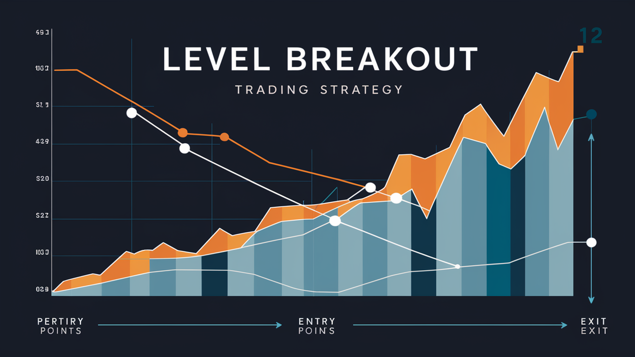
Professional market participants employ technical analysis to identify optimal entry and exit points for positions. This methodology enables identification of patterns that form under the influence of collective trading psychology. When thousands of traders simultaneously observe identical patterns, their reactions create self-fulfilling prophecies. This is precisely why understanding chart structure and recognizing key levels becomes a critically important skill for anyone serious about trading financial markets. To gain a deeper understanding of this topic, I recommend studying trading basics .
The origins of technical analysis trace back to the early twentieth century when Charles Dow formulated the foundational principles of trend analysis. Since then, the methodology has evolved significantly, enriched with numerous tools and concepts. Modern traders have access to sophisticated software platforms ( For example TradingView ) that automate chart construction and indicator calculations. However, fundamental principles remain unchanged—price discounts everything, moves in trends, and history tends to repeat itself.
Chart Types in Technical Analysis
Charts serve as the primary working tool for technical analysts. They visualize price changes over time, enabling identification of tendencies and patterns. Several methods exist for representing price data, each with distinct advantages. The choice of specific chart type depends on analysis objectives and trader preferences.
Bar Charts
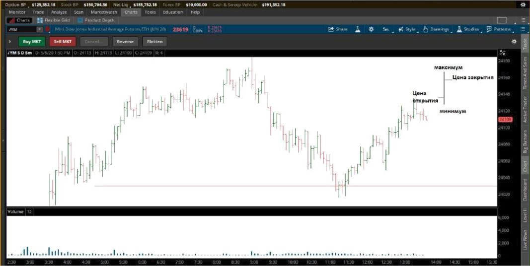
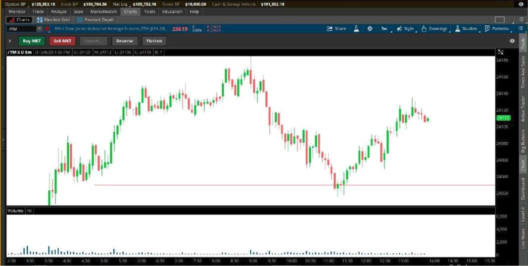
Bar charts represent price dynamics through vertical lines, each reflecting a trading period. The horizontal tick on the left marks the opening price, on the right—the closing price. The top of the bar shows the period's maximum price, the bottom—the minimum. This representation provides complete insight into price range and enables volatility assessment.
Traders working with bars pay attention to the relationship between the bar body and its shadows. A long bar with short protrusions indicates strong directional movement. When open and close prices are near extremes, this signals decisive market participant behavior. Bar charts are particularly valued by Price Action practitioners who analyze pure price movement without indicators.
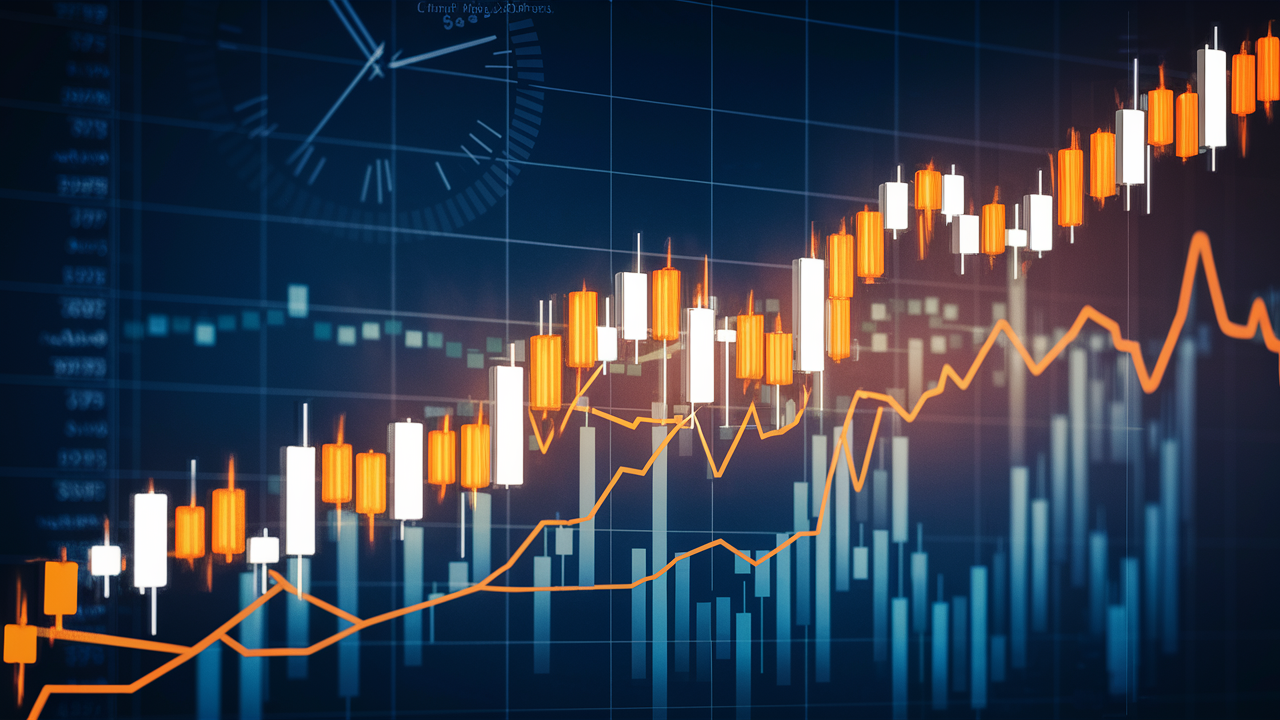
Japanese Candlesticks
Japanese candlesticks have become the dominant method for visualizing price data due to their visual clarity. This method's history spans over three centuries—invented by Japanese rice merchant Munehisa Homma. Candlestick charts contain the same information as bar charts but present it in a more convenient visual format.
The candle body forms between the open and close prices. When the close exceeds the open, the candle is colored green or white—this is a bullish candle signaling buyer victory. When the close falls below the open, the candle becomes red or black—this is a bearish candle reflecting seller dominance. Candle wicks show extreme price values during the period.
Analysis of Japanese candlesticks involves studying individual candle patterns and their combinations. Patterns like hammer, hanging man, engulfing, or doji provide valuable signals about potential reversals or trend continuation. Mastery of candle reading develops with experience and enables more precise short-term price forecasting.
Particular attention should be paid to the context of candlestick pattern formation. A single bullish candle after prolonged decline carries completely different significance than the same candle amid an uptrend. Professionals always analyze candles in conjunction with surrounding price action, volumes, and key levels.
Line Charts
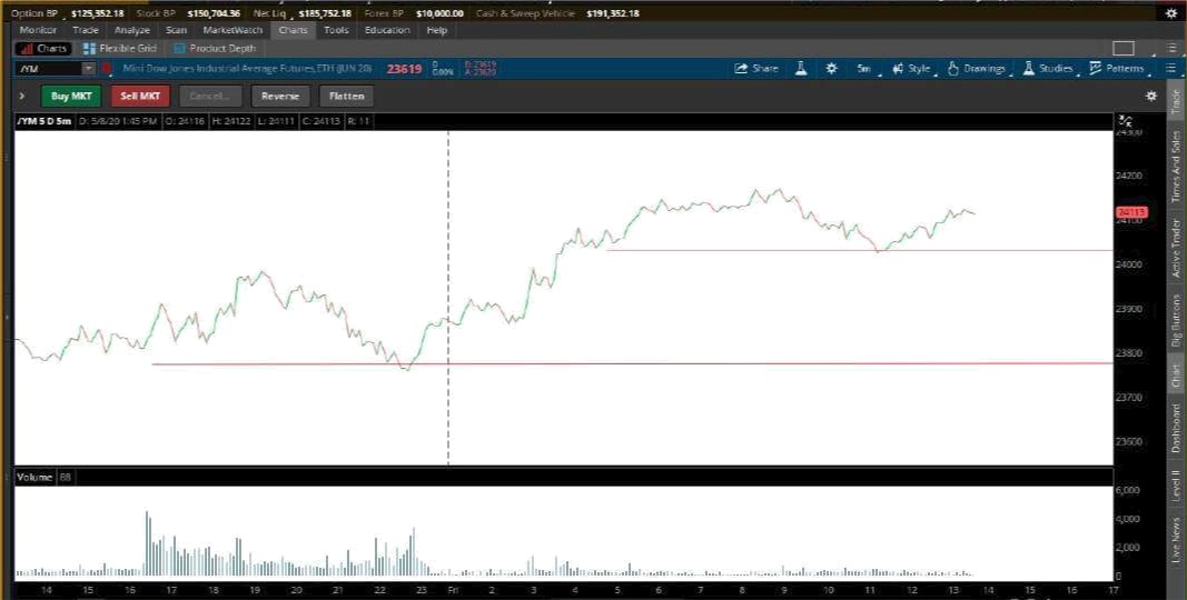
Line charts are constructed by connecting closing prices of consecutive periods with a continuous line. This represents the simplest form of price data display, discarding information about opens, highs, and lows. Such minimalism offers its own advantage—the chart becomes clean and enables easy determination of overall movement direction.
Line charts are frequently employed for analyzing long-term tendencies and comparing multiple asset dynamics on a single screen. They're ideal for beginners just starting to master technical analysis who might become confused by the abundance of information on candlestick charts. However, experienced traders rarely limit themselves to line representation, preferring more informative alternatives.
Interestingly, some analysts deliberately return to line charts to "cleanse" their perception. When attention scatters across numerous small candles, the overall picture gets lost. Switching to a line chart helps identify the main trend without distraction from details.
Market Trend Types
Understanding trend nature lies at the foundation of profitable trading. Classic wisdom states: "The trend is your friend." Trading in the direction of the prevailing tendency is statistically more profitable than attempting to catch reversals. Three primary market states are distinguished: uptrend, downtrend, and sideways movement.
Uptrend
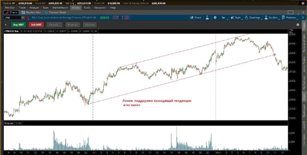
Uptrend forms when local lows and highs rise consecutively. Each pullback finds support above the previous low, and each impulse exceeds the preceding high. This structure indicates demand dominance over supply and sustained buyer interest.
To visualize an uptrend, a support line is drawn connecting consecutive lows. The more touch points this line has, the more significant it's considered. Professional traders use pullbacks to the trend line for opening long positions, placing protective stops below the support line.
It's important to understand that an uptrend doesn't exist in isolation. It develops within the context of larger timeframes. What appears as sustained growth on an hourly chart might prove merely a correction within a weekly downtrend. Therefore, analyzing multiple timeframes remains essential.
Uptrend strength is measured by the trendline angle and pullback characteristics. A healthy trend demonstrates moderate incline with shallow corrections to the support line. An excessively steep angle often signals market overheating and imminent reversal.
Downtrend
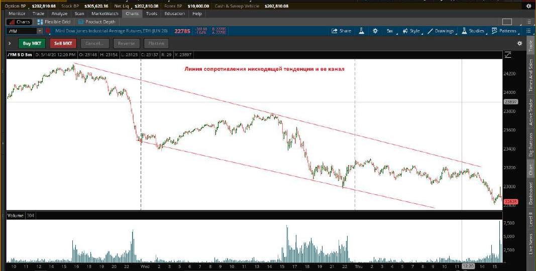
Downtrend is characterized by consecutive decline of highs and lows. Each rally ends below the previous peak, and each drop creates a new low. This reflects supply dominance and buyer unwillingness to hold positions at current prices.
Resistance line is drawn through consecutive highs of the descending movement. Combined with a parallel line through lows, it forms a descending channel. Traders sell at the upper boundary and close positions near the lower boundary, profiting from predictable movement within the corridor.
Downtrends are psychologically more challenging to trade because most market participants experience fear during price declines. However, understanding bearish trend mechanics and the ability to work with short positions opens additional profit opportunities.
A characteristic feature of downtrends is their tendency toward sharp accelerations. While bull markets rise via stairs, bear markets fall via elevator. Panic selling can destroy months of growth within days.
Sideways Trend (Range)
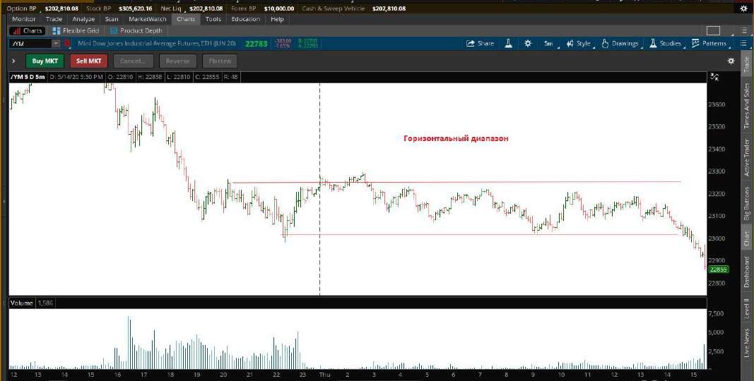
Range represents a market state where price oscillates within a horizontal band without clear directional movement. Neither buyers nor sellers can gain decisive advantage. Such consolidation periods frequently precede strong impulse moves.
Range trading requires a specific approach. Aggressive traders open positions from range boundaries anticipating bounces to the opposite side. Conservative participants prefer waiting for breakout and trading in the new trend direction. False breakouts occur frequently in ranges, making confirmation signals critically important.
Statistically, markets spend significant time in sideways consolidations. The ability to recognize ranges and adapt trading strategy accordingly distinguishes professional traders from beginners.
Ranges can be viewed as energy accumulation periods before the next directional move. The longer consolidation lasts and narrower the range becomes, the more powerful the subsequent breakout typically proves.
Support and Resistance Levels
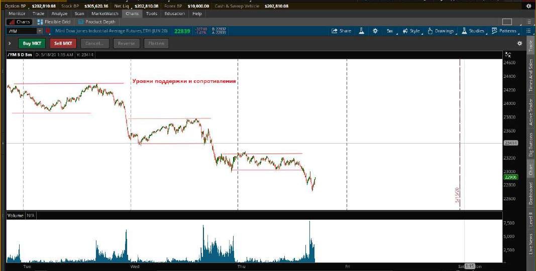
The concept of support and resistance levels represents a cornerstone of technical analysis. These price zones represent areas of concentrated trading interest where power redistribution between buyers and sellers occurs. Understanding level formation and testing mechanics proves critically important for any trader.
Support Level Nature
Support level forms in a price zone where demand systematically exceeds supply. When price declines to this level, buyers activate, considering current prices attractive. Their combined purchases halt the decline and reverse price upward.
The more frequently price tests a support level and bounces, the stronger that level is considered. However, each test gradually weakens the level because some buyers have already opened positions and no longer provide support. Thus, repeatedly tested levels eventually break.
When identifying support levels, it's important to understand these aren't precise lines but rather price zones. Markets rarely reverse exactly at designated prices. More commonly, there's "play" of several points in either direction.
Resistance Level Mechanics
Resistance level operates by the reverse principle. In this price zone, supply exceeds demand. Sellers anticipating decline or taking profits create pressure that halts growth and reverses price downward.
Psychological levels—round numbers like 100, 1000, 10000—frequently serve as strong resistance zones. This is explained by human tendency to take profits or place orders at "nice" price marks.
Level Role Reversal
The most important characteristic of levels is their ability to switch roles after breakout. When price confidently breaks through resistance, it transforms into support. Former sellers now view this level as a buying point, while buyers see it as a zone for adding to positions.
Similarly, broken support becomes resistance. Traders who opened long positions at this level seek to exit without losses when price returns. This creates selling pressure that prevents price from recovering above the broken level.
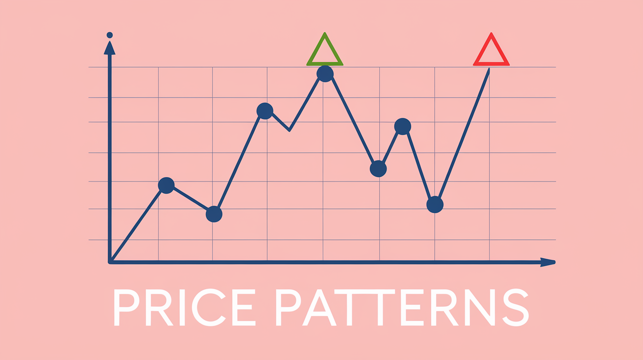
Psychology Behind Chart Patterns
Every chart element reflects real actions of market participants. A long lower candle wick shows sellers attempted to push price down but met aggressive buyer resistance. Understanding the psychological subtext of price movements enables deeper signal interpretation and more informed decisions.
Major market players— market makers and institutional investors—leave characteristic traces on charts. Sharp volume spikes, unusual candlestick patterns, sudden level breakouts may all indicate large capital activity.
Liquidity plays a special role in chart analysis context. Stop orders from retail traders accumulate behind support and resistance levels. Large players frequently trigger false breakouts of these levels to activate stops and build positions at favorable prices.
Common Mistakes
Beginners often make typical errors when working with charts. One major mistake is attempting to see patterns where none exist. The human brain tends to find regularities even in random noise. This leads to overtrading and losses.
Another common problem is ignoring higher timeframe context. A beautiful buy signal on an hourly chart may prove a trap if the daily trend points downward. Multi-timeframe analysis should become a mandatory part of the trading routine.
Finally, many overestimate the significance of individual signals and underestimate the importance of risk management . Even perfect technical signals don't guarantee profit. Markets are inherently unpredictable, and the only way to survive long-term is strictly controlling loss size on every trade.
Conclusion
Technical chart analysis represents a fundamental skill for any trader. By mastering various chart types, learning to identify trends, and properly constructing support and resistance levels, you gain a structured approach to trading decisions.
Regular practice and continuous learning are keys to mastery. Analyze charts daily, track your observations, study price behavior under various market conditions. Over time, intuitive understanding of chart patterns will become your natural skill.
Frequently Asked Questions
Japanese candlesticks are the optimal choice for beginners. They clearly show the balance of power between buyers and sellers, are easy to read thanks to color coding, and allow quick assessment of market sentiment for any time period.
Trend changes are identified by several indicators: breakout of key support or resistance levels, formation of reversal candlestick patterns, divergence with volume indicators, and changes in the structure of highs and lows. It's important to wait for confirmation rather than trading on the first signal.
Support level is a price zone where demand exceeds supply and price tends to bounce upward. Resistance level is a zone where supply exceeds demand and price tends to pull back. When broken, levels switch roles: support becomes resistance and vice versa.
Trading in a range is possible but requires a specific approach. Traders buy near the lower boundary and sell near the upper boundary, using tight stop-losses. However, the main profit is made on the breakout, so many prefer to wait for price to exit the range.
Timeframe choice depends on trading style. Scalpers work on M1-M15, day traders on M15-H1, swing traders on H4-D1, position traders on D1-W1. It's recommended to analyze multiple timeframes: higher for trend direction, lower for entry timing.
About the Author
Author: Igor Arapov — independent researcher in trading psychology and behavioral finance, practising trader since 2013, founder of arapov.trade, author of a trading book series (Open Library ), (ORCID: 0009-0003-0430-778X ).