Volume analysis shows not where price went, but how many real trades stand behind that move. If price rises on heavy volume, there is money and interest behind it, and the move can be trusted. If it rises on falling volume, buyers are few, and that kind of rise often turns out to be a trap. Volume reveals where a large player stepped into the market, and where it is just empty motion with no money in it.
I did not arrive at volume right away. At first, like almost everyone, I watched candles and figures, then I cycled through indicators hunting for the magic one. The picture only grew more honest once I added volume under the chart: price easily draws a pretty reversal that is not really there, while volume hints at whether real money stood behind the move or thin liquidity painted it in. This guide gathers into one system everything I use myself: effort and result by Wyckoff, peak levels and Volume Profile, the market profile by Steidlmayer, and an honest source of data.
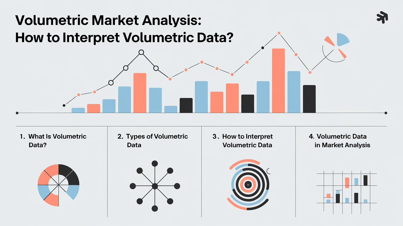
In this article we'll cover:
- volume shows the money's participation behind a price move, while price itself easily misleads;
- the effort-result principle checks volume against the price move and reveals who really controls the market;
- peak levels, the POC and Market Profile show where large capital considers price fair;
- honest volume exists only on exchange instruments, on forex it is tick-based, and that has to be taken into account.
Let's start with what even counts as volume and what exactly it measures.
What market volume analysis is
Volume analysis is a method of reading the market by the number of trades that passed over a period, not just by the price move.
Volume is how many contracts or lots really changed hands in a single bar. High volume means many participants and money in the moment, low volume means a lull. What matters is not the figure itself but its dynamic: one bar is compared with its neighbors, did volume rise or fall against what came just before. The logic of the method is simple. A large participant cannot build or unload a big position unnoticed, its activity leaves a trace in the volume. So through volume people try to make out what the money is doing, not the crowd.
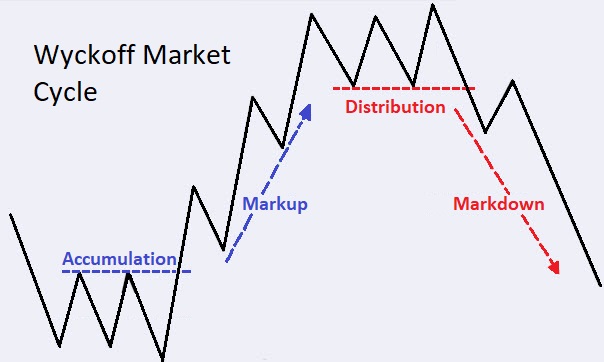
From this come two basic states of the market. Accumulation is when a large player gradually builds a position in a sideways range, not letting price rise noticeably. Distribution is the reverse: a large player hands out the position it built at high levels while the crowd buys. These two phases lie at the base of everything that follows, and it is precisely them that volume helps make out earlier than it becomes visible on price itself.
In short: Volume analysis is reading the market by the number of trades that passed, not by price alone; what matters is not the figure itself but its dynamic relative to neighboring bars, and so the phases of accumulation and distribution of large capital show through.
The effort-result principle: the core of the Wyckoff method
The Effort and result principle is a Wyckoff rule by which volume is treated as the applied effort and the price move as its result, and these two are always checked against each other.
This approach was devised by Richard Wyckoff, an American stock operator of the early twentieth century. He watched the ticker tape and noticed that there are participants who steadily earn in any trend: price is moved not by the crowd but by large capital, and it leaves a trace in the volume. Today these participants are more often called smart money, but Wyckoff's idea was the same. And the main thing: this is not an indicator and not a set of rigid rules, but a skill of matching volume with the price reaction right on the bars.
This is where the most practical part begins. Normally a big effort gives a big result: high volume and a wide candle in the direction of the move means the market really is going. But when the effort is huge, volume jumped, and price has barely shifted, that is the main signal. It means someone is absorbing the market on that volume, taking for themselves everything the crowd offers. There is no result because the opposite side is dampening the move. In my experience such places before a reversal are the most interesting of all. A simple example from practice: price is falling, on another flush down the volume sharply grows, while the fall itself slows, the bars become shorter. The effort to sell is huge, but there is no result on price, and for me that is a sign that someone is calmly buying up the supply. The logic of large capital and the very phases of accumulation and distribution I break down in detail in the course section on the Wyckoff method.
Out of this same pairing grows the climax. A selling climax is the moment when a downtrend runs out of breath: after a long decline comes a sharp flush on huge volume, and then price refuses to fall further and quickly returns back. The crowd dumps positions in panic, while large capital calmly accumulates at the low price. A buying climax is the mirror: up high, after a long rise, there is a spike of volume but price no longer rises, because the position is being handed out to those who believed in continuation. How to catch such a reversal by volume on a live bitcoin example I show in the video on volume divergence and pinpointing the extreme.
These turns at the boundaries of a range have settled names from Wyckoff himself, and they are read with the same eye for effort and result, not with an indicator:
- Selling Climax (SC) and Buying Climax (BC): peak volume at the end of a move after which price refuses to continue, the effort is huge and the result is missing.
- Automatic Rally (AR): the first bounce after a climax, it outlines the top of the future range.
- Secondary Test (ST): a return to the climax zone on lower volume, checking whether pressure is left.
- Spring and the mirror Upthrust (UT/UTAD): a false break through the range boundary, price runs the stops beyond the level and quickly comes back, while volume gives away that the break is empty.
- Test: a revisit to the level after a spring on low volume, supply is exhausted and the way up is open.
- Sign of Strength (SOS) and Last Point of Support (LPS): a wide move out of the range on raised volume and a pullback to its edge from which the trend begins.
These are not signals from a script but volume-recognisable places where large capital ends one phase and starts another. I do not memorise them as formulas: each one is the same question, did effort match result.
In short: The effort and result principle checks volume against the price move: high volume with a wide candle means the market is going, while big volume with price standing still means someone is absorbing the flow, and that is the main reversal signal.
Bullish and bearish volume: trend direction and strength
Volume is neutral in itself; the price it appears on gives it direction. A simple working rule: rising volume on down bars is seller pressure, a bearish mood, while rising volume on up bars is buyer pressure, bullish. When you see large bars precisely on the fall, the market is being given away, not bought up. Then volume tests the strength of the trend. A healthy uptrend makes new highs, and every push up goes on rising volume, while on pullbacks volume instead drops, showing that sellers are weak. A strong up candle on big volume is a real move of large capital, while the same candle on thin volume is often a dud with no force behind it.
Divergence stands apart, the most valuable warning signal. Price still makes new highs, while volume is falling: there are fewer and fewer new buyers, the move holds on inertia, and the trend is losing strength. It is important to tell divergence from an ordinary pullback: on a healthy pullback volume falls and rises again on the resumption of the trend, while in divergence it does not come back even when price tries to go further. Say on the first day price travelled 84 points on average volume, and the next day almost as much, 79, but volume grew about twofold while the close was weak: the effort grew, the result did not, and that is already a sign of a climax, not of strength.
So I do not trust a breakout or an impulse without confirmation by volume, and weak volume on a strong move is for me a signal to stand aside, not to jump in. And here is what matters, this is my position and not a universal rule: volume hints at a reversal but does not guarantee it. Divergence and climax are probabilistic signals, sometimes a trend drags on for a long time after them, so against the trend on divergence alone I do not enter, but wait until it is confirmed by structure and the price reaction.
In short: Volume is neutral, direction is set by the price under it: rising volume on a fall is sellers, on a rise buyers; and divergence, when a new high comes on lower volume, warns of a reversal earlier than price itself.
The deficit of demand and supply: why price actually moves
Here I will give an angle that turns the usual explanation on its head, and understanding it matters more than learning a dozen patterns. Most textbooks say: price falls because sellers came. In my experience it is the opposite. A Demand deficit is a situation where large capital stops buying, and no force is left in the market ready to hold price. The logic is simple: professional money never buys expensive. If at high prices they are not interested, their demand simply disappears from the venue, and only sellers are left, competing with one another and pushing price down. So a bear trend is not where there are many aggressive sellers, but where the large buyer has left.
A rise works as a mirror. The true cause of a sustained climb is a deficit of supply, not a crowd of buyers. At a level that large capital considers cheap, it builds a position and gradually buys up all the available supply. When the sellers at that level run out, there is no one left to sell to, and price has nothing left to do but go up at market. I often put it this way: the cause of a rise is always a deficit of supply, and the cause of a fall a deficit of demand. Volume is exactly what catches the moment when one of the sides runs out of breath, earlier than it becomes visible on price itself.
Behind this stands the eternal problem of large capital: a deficit of liquidity. Big money would gladly buy as much as it likes at a cheap price, but there are simply no counterparties for its whole position. So it has to play with price to lure the crowd onto the unfavorable side: knock out a level with a false break, collect other people's stops and take that liquidity for itself. On volume this reads as a spike on the false break with subsequent drying-up: the supply ran out, and the large player has nothing left to do but move price its way. So the deficit of demand and supply meets the mechanics of false breakouts.
Out of this same logic grows the path of least resistance. When large capital has already built a position and is interested in a rise, its trace is a skyscraper of volume on rising bars: an abnormally high column where price went up. And the reverse, when it is set on a decline, the same spikes land on falling bars. I look at which side these skyscrapers appear on, and that hints where the market finds it easier to go next. This is not a prediction but a shift of probabilities: the path the money has already walked is usually the path of least resistance.
In practice I use this as a guiding filter, not a ready signal. If the volumes say the path of least resistance is down, I look not for buys but for sells off resistance, and I hold in advance the scenario's cancellation point: the price whose acceptance above it zeroes out my bearish view. A plan without a cancellation point is, for me, not a plan. And I will repeat, this is my position and how I work, not a directive to you personally: the deficit of demand and supply is not an entry button but a way to understand who actually controls the market right now.
In short: The cause of a fall is a deficit of demand, when the large buyer leaves, and the cause of a rise a deficit of supply; a skyscraper of volume on rising or falling bars shows the path of least resistance, and I use it as a guiding filter with a mandatory scenario cancellation point.
Peak volume levels, Volume Profile and the POC
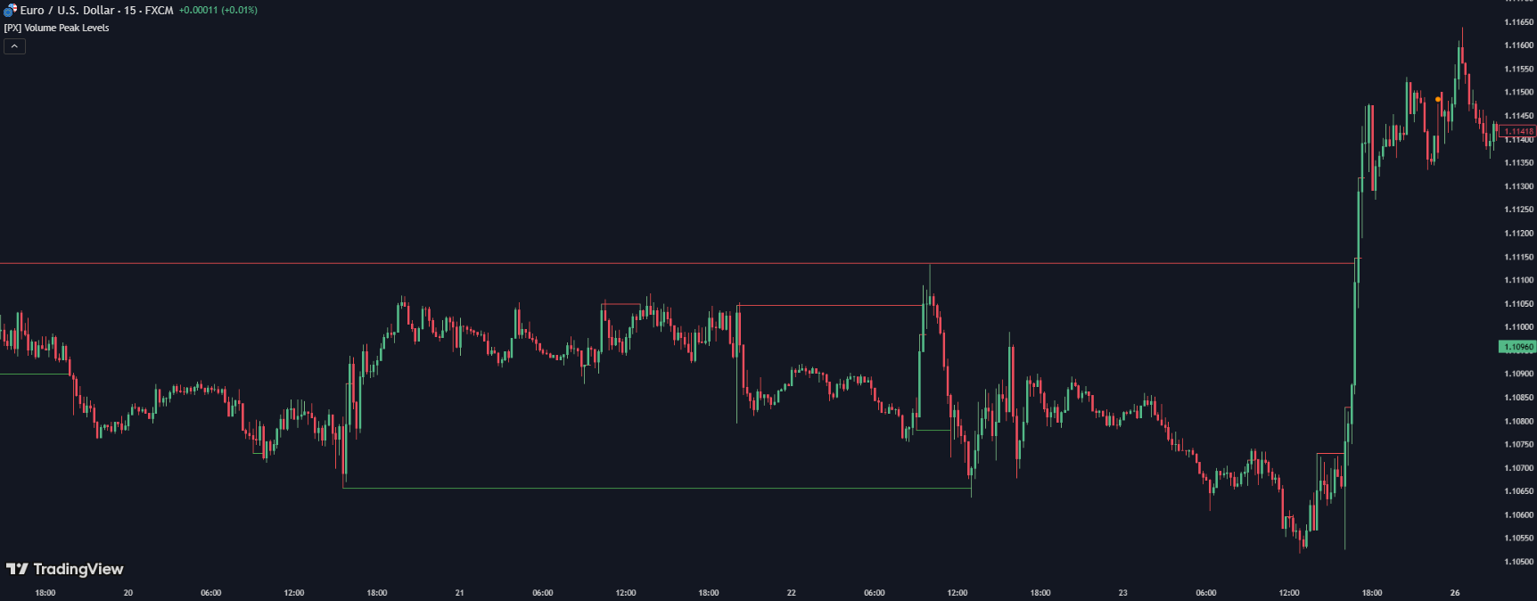
A Peak volume level is a price level at which the maximum trading volume passed over a chosen period; large capital was active there, so it works as strong support or resistance.
The Volume Profile tool helps find such zones. It shows volume not by time, like ordinary columns, but by each price, as a horizontal histogram. The highest peak of this histogram is called the Point of Control, or POC: the price with the greatest traded volume, a kind of fair price around which the market revolves. Around the POC lies the value area, where about 70 percent of all volume passed, and it has two boundaries, the upper VAH and the lower VAL. Between them the market spends most of its time, and exits beyond the boundaries often become either the start of a trend or a trap with a return back. The untested, or naked, POC stands apart: a volume peak to which price never returned after it formed. Such levels work like a strong magnet, the market seems to remember the volume left there and sooner or later comes to test it.
Delta helps you understand what is happening at a level, the difference between buy and sell volume. A predominance of buys speaks of an aggressive build-up of a position, a steady predominance of sells of distribution. There is also a separate phenomenon, absorption: a huge volume passes at a level while price barely moves, because a large limit player soaks up the whole flow of the crowd's market orders, not letting price through. Such absorption often precedes a reversal. Low-volume zones I read as a mirror to peaks: if inside the range there is a gap in the histogram, this is a stretch the market does not consider fair, and price is skipped through there quickly. Such voids are handy as a target reference: between two peak levels price usually flies through the thin zone in one move.
The profile, meanwhile, can be built for different tasks. A session profile shows volume over one trading session and is handy for intraday trading, while a composite one stacks volume over weeks and months and draws large structural levels that hold for a long time. I usually keep a composite profile over a significant range to see the main zones, and when needed I add the current week's profile for detail: the longer the period, the weightier the peak levels, but the rarer they appear. The climactic volume stands apart, an abnormal spike at the very peak of a move: after a long rise or fall it often means a reversal, since that is how the crowd's last push looks, which large capital uses to close a position.
In short: A peak level is the price with the maximum volume, the POC, and around it lies the value area with boundaries VAH and VAL; delta hints at direction, while absorption and an untested POC often work as a reversal and as a magnet.
Market Profile by Steidlmayer: the value area
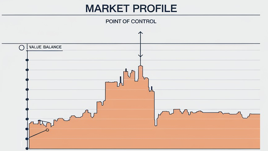
Market Profile is a way of organizing data on price, time and volume as a distribution that shows at which prices the market spent the most time and trades.
This approach was devised by Peter Steidlmayer, a trader from the pit of the Chicago Board of Trade, CBOT, back in the early eighties. He noticed a simple thing: price by itself does not tell you whether it was accepted, but the time spent at a price tells almost everything. If the market stands at a level for a long time, both sides consider it fair, and if price is skipped through in seconds, then it was rejected. Hence his formula: price plus time give value, not price alone. On the chart this is drawn with letters, each letter, or TPO, means that in its half-hour slot the market traded at this price. The more letters in a row, the denser the interest, and so from vertical candles a horizontal bell is assembled, by which you immediately see the market's center of gravity.
The most useful part of the profile is the value area, into which about 70 percent of the trading falls, that is the range of prices the market deemed fair. In the center the POC, at the edges the boundaries VAH and VAL. Inside the area price is fair, everything above the market in the moment considers expensive, everything below cheap. There is a working observation many have checked: if the day opens beyond yesterday's value area, price very often returns back into it. The shape of the profile also hints at the day's character: a smooth symmetric bell is a balanced day with price going nowhere, while a stretched thin profile is a trend day where looking for reversals against the move is not worth it.
Out of this grow several working scenarios that I use as a reference. The first and most frequent is the return to the value area: if the day opened above yesterday's area and buyers did not lead price further, it often slumps back to fair prices, and the first target becomes the POC. The second is a bounce off the boundaries, when price approaches VAH from above or VAL from below, stalls with no volume for continuation, and turns inside the area. The third is the opposite, on a breakout: having entered a thin node of low volume, price has nothing to grip, and skips through it with a sharp impulse to the next dense node. The initial balance helps too, the range of the first hour of trading: while price is inside it, the market is in balance, while an exit beyond its bounds on volume often sets the session's direction. Separately I keep in mind single prints, single imprints the market skipped on emotion and did not accept: later price likes to return to them, refilling the missed zone.
I am often asked what to choose, the profile or Wyckoff, and they expect me to name a winner. In fact they are about one and the same: both read the market as an auction and try to understand where large capital is active and where the fair price is. The difference is in emphasis. The profile answers the question where, with statistics and the value area. The Wyckoff method adds why and in which phase the market is right now. I build my trading on Wyckoff and volume, and I use the profile as a supplement, to see faster how far price has gone from the fair center.
In short: Market Profile is the market as an auction, where price plus time give value: the POC in the center of the value area, above expensive, below cheap; the profile answers where it is fair, and Wyckoff why and in which phase.
How I build levels and take an entry by volume
My routine starts on the profile, hunting the fattest volume peaks, those are my key levels, and then I check whether that price carries any history: was there a reversal or a halt here earlier. When two things coincide, big volume and the market's memory, the level becomes truly strong. It is handy to tell apart high- and low-volume nodes, HVN and LVN: a dense cluster slows price and works as support, while a sparse stretch price skips through. The volume picture I build on the higher timeframe, mark the main HVNs and naked POCs, lay ordinary horizontal levels on top, and look for the entry on the lower one already. The algorithm of working with levels itself I have laid out step by step in the course section on the liquidity deficit and working with levels.
Peak volumes rarely appear by chance, more often they land on the Wyckoff phases. In accumulation, spikes of volume flare at the lows, large capital builds a position off frightened sellers, and on the profile this draws a fat cluster at the bottom. The characteristic point here is the spring, a false break under the bottom of the range with a collection of stops: volume flares on it while price quickly returns, and often it is precisely there that a level forms from which a rise starts. In distribution the mirror event is called an upthrust, a false exit upward on which the position is handed to the crowd that entered. So a peak level I read not on its own, but together with the phase.
And about the frequent mistakes with the profile, so you do not repeat them. The first is to trade the POC mechanically, like a button, without regard for the phase and the price reaction. The second is to confuse the forex tick volume with the real exchange one and trust it as absolute truth. The third is to build the profile on too small a timeframe, where peaks are random and quickly go stale. Out of a dozen peaks on the profile I work not with all of them, but only with those that coincide with the boundary of a range, with a historical level or with an untested POC, while a lone peak in the middle of a move with no tie to structure I more often skip.
At the entry itself I do not rely on the profile alone, but wait for the price reaction: a reversal candle, a slowdown, a spike of delta in my direction. Let me show on an example. An asset traded in a range for several weeks, and under the lower boundary on the profile a fat peak is visible, coinciding with a historical support level. This is my zone of interest, but I do not buy in advance. I wait for price to approach the peak again, and watch the reaction: a reversal candle appears, delta shifts to buys, and I work off the level upward with a stop just below the peak, while the target I set at the nearest large volume node above. My iron rule: peak volume is not a command to enter but a reason to take a closer look, and in a vacuum I never trade the POC. I keep a short stop and take trades where profit relates to risk at least as three to one, then even an imperfect run of entries leaves a profit over the distance. I am often asked about the percentage of winning trades, and my position here is simple: there is no need to chase a high win rate. With a short stop and a risk-to-profit of at least three to one, even a modest share of lucky entries leaves a profit, so I count not the trades I guessed but their math. This is not advice to you personally but how I work.
In short: A strong level is the coincidence of a fat volume peak with the market's memory and a Wyckoff phase: I mark the zones on the higher timeframe, wait for the price reaction at the entry, keep a short stop and take a risk-to-profit from three to one.
Volume analysis versus indicators and an honest data source
Set volume analysis against technical analysis and you have a false fight: they are two layers of one picture, not rivals. Classical technical analysis works with price: levels, figures, patterns, it describes what price has already drawn. Volume analysis adds a second dimension, the participation of money, and answers the question of whether real trades stand behind the price action. So it is more honest to add them than to oppose them: a support level with large volume is more reliable than the same level in silence, and a breakout on a spike of volume is more credible than a breakout on a dry market. The problem with pure indicators is not that they do not work, but that they are derived from price and lag, whereas volume is closer to the real action of participants. Even volume tools like VWAP remain derivatives: they average already-passed volume rather than showing the large player's intent directly. Volume, in my experience, works best on manipulations: before a strong move the large player knocks out a level with a false break and collects stops, and on the chart this is seen as a drying-up of volume, when sellers run out and the large player has nothing left to do but buy at market.
And separately about the data source, because here it is easy to be fooled. Honest volume I look at only on the futures of the CME exchange, where every trade is documented by clearing and the figure can be trusted. On forex there is no single order book, only tick volume is available, the number of price changes, and it correlates with the real one with a noticeable error. In crypto, volume on different exchanges differs greatly and is easily painted, so I treat it most cautiously of all. A grail, meanwhile, I do not consider volume: it gives no hundred-percent accuracy and works only paired with levels and the market phase, not instead of them. From here it is logical to go into systematic learning, the whole base I have laid out step by step in the free trading course.
On futures I look not only at volume but at open interest, the number of unclosed contracts on the market. This helps tell live volume from dead: when price rises and open interest rises with it, new money is coming into the market, and the move can be trusted more. And when volume is high but open interest falls, most often old positions are being closed rather than new ones arriving, and the strength of such a move is deceptive. This is a fine layer, available precisely on the exchange, and one more reason why I prefer exchange data to over-the-counter. For a beginner open interest is not mandatory at the start, but as soon as access to exchange data appears, the habit of cross-checking volume against it noticeably cleans up the picture.
In short: Volume and technical analysis are layers, not rivals: a level with volume is more reliable than a level in silence; honest volume is only on CME futures, on forex it is tick-based with error, in crypto it is painted, and a grail I do not consider volume.
Frequently Asked Questions
It is reading the market by the number of trades, not just by price. Volume shows how much was really traded per bar. If a large volume stands behind a price move, there is money in the market, and if the volume is dry, the move is dangerous to trust.
Volume is the effort, the price move is the result. A big effort should give a big move. If the volume is huge but price stands still, the opposite side is absorbing the market, and that is a frequent signal of a reversal.
A rising trend on rising volume is confirmed, buyers are adding. If price rises while volume falls, interest is fading and a correction is possible. High volume on a level breakout says the breakout is real.
Volume Profile shows how much volume passed at each price level, not over time. POC is the level with the maximum volume, the point of greatest participant interest. Such zones often work as strong support and resistance.
Forex is an over-the-counter market with no single center, so total trade volume is not counted there. Only tick volume is available, the number of price changes over time. It correlates with real volume but with error, so it is a guide, not exact data.
In my experience, no. Volume gives no signals on its own, it confirms or cancels what is visible from levels and the market phase. It works best paired with levels, not instead of them.
About the Author
Author: Igor Arapov — independent researcher in the psychology of investment decisions and behavioral finance, practising trader since 2013, founder of arapov.trade, author of a trading book series (ORCID: 0009-0003-0430-778X).