Reading a chart means understanding, from price and volume alone, where the market is expensive and where it is cheap, and which way the move is more likely to go. The frame rests on three things: support and resistance levels mark the important zones, the timeframe sets the scale of your view, and a trading channel draws the structure of the trend. On top of all of it I put volume, because that is what separates a real move from a fake one and brings any markup to life.
Most people come into trading through technical analysis, and so did I back in the day, having traded for years now. A chart gives you a picture you can see, and the temptation creeps in: just recognise the next pattern and you are away. The trouble is that a beginner is usually shown chart reading as a set of ready-made signals, see the shape, click buy. Over distance it does not work like that. So we will go through how to read a chart for real: from the kind of candle and the timeframe to levels and channels, and why I take an entry not on a pretty pattern but on the reaction of price with volume confirmation.
In this article we'll cover:
- what technical analysis reads and why the most objective thing on the chart is a level;
- how line, bar and candlestick charts differ and which timeframe to take for them;
- how to build levels and channels from zones and real points, not bend them to wishful thinking;
- why chart patterns come out roughly fifty-fifty and where reading price turns into reading volume.
First, what actually sits behind the words technical analysis and what props it up.
What is technical analysis and what does it rest on?
Technical analysis is a method of studying the market by the price chart and trading volume, without looking at news or company reports. The idea underneath is this: everything the market knows is already absorbed into the quote, so the chart itself is what you read.
Three classic principles sit beneath it. The first says that price accounts for everything: any news and expectations already live in the quote. The second holds that price moves in trends rather than at random. The third reminds us that history repeats, because the psychology of participants stays the same year after year. To my mind that third principle is the essence of the whole method: a chart is not mathematics but a reflection of the fear and greed of the crowd, which is why the same situations keep recurring. The toolkit here covers levels, trend lines and channels, price patterns, candlestick patterns and indicators. But the most objective thing among them is a level: all participants see it the same way and price genuinely turns from it, whereas patterns and indicators are noticeably more subjective. That is exactly why I build my method from levels and keep patterns and indicators on a second tier, as a supporting layer rather than the deciding one.
In short: Technical analysis reads the market by price and volume, on the premise that all the information is already in price; the most objective thing in it is a level, which everyone sees the same way, while patterns and indicators are far more subjective.
Chart types: line, bar and candlestick
A trading chart is a visual representation of how an asset's price changes over time, the foundation of all technical analysis. Its simplest form is the line chart, which connects only the closing prices of each period with a line.
There is not much detail in a line chart, but it shows the big picture and the long-term trend nicely, without extra noise, and I do glance at it sometimes when I want a quick read of structure on a higher scale. A bar and a candle are built richer and give you all four reference prices for the period, the open, the high, the low and the close, and that is exactly what people trade on seriously. Put it in numbers: say over an hour a pair travelled from one mark to another; the line will show only the closing figure, while the bar and the candle will also draw the open, the high and the low, the whole route price took inside that hour. So the choice of chart type is not cosmetics, it is a question of how much information you actually see.
In practice each chart type has its niche. I keep the line chart for a quick look on a higher scale, when I need a single sweep of the eye to grasp the phase the market is in and where the general trend points, without being distracted by intraday ripple. But once it comes to finding an entry, a bare line is no longer enough: it matters to see how exactly price lived through the period, where it opened, how far it stretched up and down and where it closed, because the balance of buyers and sellers hides precisely in those four points. Only the bar and the candle carry that data, and that is why serious trading is done on them, not on the line.
In short: A trading chart can be a line, a bar or a candlestick: the line shows only the close and suits the big picture, while the bar and the candle carry the full price data for the period, open, high, low and close.
Bar vs Japanese candlestick: what's the difference?
It is worth settling one thing in your head here: a bar and a Japanese candle deliver exactly the same set of data, just in a different shape. A bar chart draws the period as a vertical stroke: the tick on the left is the open, the tick on the right is the close, and the line itself is the span from low to high. It looks strict and spare, but it takes getting used to, because you have to peer at where exactly the close sits.
A Japanese candle carries the same four prices but adds a coloured body between the open and the close and thin wicks at the edges. A green or white candle says price closed above its open, a red or black one that it closed below. This colour language registers instantly, which is why candles became the standard for most professionals, and I have worked on them for a long time myself. But I always add an important caveat: one bare candle on its own is roughly fifty-fifty, and it only comes alive at a level and with volume confirmation. So candlestick patterns are read strictly in context, not blindly off the picture.
In short: A bar and a candle carry the same four prices, open, high, low and close, only the candle adds a coloured body and reads at a glance; but a lone candle on its own is roughly even odds, and it gains meaning only at a zone with volume.
Timeframes: what they are and which one a beginner should use
A timeframe is the time interval that a single candle or bar holds: on the hourly, for instance, one candle packs in exactly an hour of trading. Timeframes split into lower, middle and higher, from the minute charts through the hourly to the daily and weekly, and you switch between them right in the terminal with one click.
The same market on different timeframes looks like two different worlds: on the minute scale, constant chop and noise, on the daily, a measured, readable trend. The lower the period, the more random noise it carries; the higher, the more clearly the significant levels and the direction emerge. Roughly, they map onto styles: minutes for scalpers, hours for intraday traders, days for those who hold for weeks, weeks for investors. And here is my unambiguous advice to a beginner: start with the higher timeframes, the hourly and the daily. There are several reasons, all weighty: less noise and fewer false signals, more time for calm analysis, a smaller share lost to spread and commissions, and on top of that a higher chart does not demand you sit at the screen all day and fits easily around a job. Minutes and scalping lure you with speed, but for a beginner that is most often a short road to a blown account, because noise, emotions and costs all work against them. I will not push this on you, only share my view: trading needs a cool head more than fast clicks.
In short: A timeframe sets how much time one candle holds, from a minute to a week, and at the same time outlines your style; a beginner is steadier on the higher periods, the hour and the day, where noise is quieter, analysis is roomier and the spread eats less.
Multiple timeframe analysis: the higher timeframe rules the lower
This is probably the single most important rule in working with timeframes. The higher period always outranks the lower: it sets the direction, the lower one is only there for a clean entry in that direction. If the daily trend is up, hunting for sells on the five-minute is pointless, you will be rowing against the current.
So I work top down. First I look at the higher chart: where the trend is, where the key zones are, where big capital is looking. Only then do I drop to the lower one to find the precise moment to enter in the direction of the higher trend. In practice it goes like this: on the daily there is a clear uptrend and price is approaching strong support, I mark that as context and look only for buys, then I switch to the hourly and wait there for a clean signal off the zone, a false breakout or a reversal with volume, say. The higher timeframe told me where, the lower one told me when. Without that pairing a beginner often sees a move down on the minute and sells, missing the powerful uptrend on the daily. I usually build the scenario on the four-hour and catch the entry around the fifteen-minute, so I see both the forest and the trees.
In short: The higher timeframe always outranks the lower: it sets the direction, the lower one is only for entering in that direction, so I go top down, from the trend and zones on the higher chart to the entry point on the lower.
Market phases: trend, range, and balance vs imbalance
Before I look for an entry, I always answer a simple question: what phase is the market in right now. A market phase is the current mode of price movement, and there are essentially three: an up trend, a down trend and a range, also called a sideways. In a trend price moves steadily one way and updates its extremes, while in a range it shuffles inside a band between support and resistance. Mixing them up is half of all a beginner's mistakes: trend tactics in a range cut the account, and trying to catch reversals in a strong trend turns into catching falling knives.
A deeper logic sits behind these modes, balance and imbalance. A range is balance, when supply and demand are roughly equal, and it is exactly in such price boxes that big capital quietly builds or unloads a position. A box at the bottom, after a long fall, more often turns out to be accumulation, where smart money buys from a frightened crowd. A box at the top, after a long rise, is more often distribution, where the same position is handed out into the euphoria. A trend is already imbalance, price leaving the box in the direction big capital wants to lead it. Which box exactly is in front of you, accumulation or distribution, is told most reliably by volume, not by the drawing of price. Rising volume on upticks inside the box gives away hidden accumulation, while spikes on the down moves with price standing still more often speak of distribution.
The practical takeaway is simple. First decide the phase, and only then pick the tool for it: in a range work the edges of the band, in a trend only with the trend and on pullbacks. The common slip here is that a beginner drags a trend tactic into a range: buys the break of the upper edge of the box and instantly catches price returning inside the band. Fighting the phase costs you dearly, and that, to my mind, is the first thing the eye should be trained on, before any patterns or indicators.
In short: The market is always in one of three phases: up trend, down trend or range; a range is balance and a price box of accumulation or distribution, a trend is imbalance, and which box is in front of you is told by volume; decide the phase first, then pick the tool.
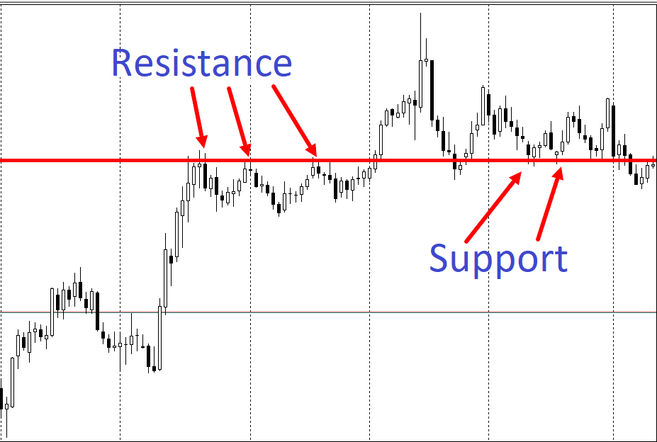
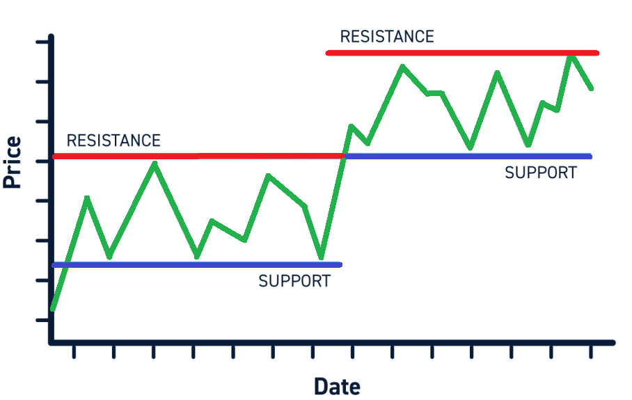
Support and resistance: a zone, not a line
A support and resistance level is a price zone where the move has stalled or reversed before. Support is the zone below, where buyers usually seize the initiative, and resistance the zone above, where sellers come alive. They work on the market's memory: participants remember where price turned and place their orders there again, so a lot of orders pile up at these zones.
The more serious a zone, the longer the market's memory of it: a patch price respected many times and where large volume rolled through outweighs a recent mark with only a couple of touches. So I map a grid of these strong zones on the higher chart in advance and then work only off them, simply ignoring weak little touches as noise.
And here is where beginners make the main mistake, so let me stress it: a level is not a line, it is a range. There is no need to drag a perfectly exact line along the very peak, price is alive and rarely reverses to the tick. I always build a level as a zone, a small price corridor where there was a reaction before, and I build it from several touches: the more often price answered to a zone, the stronger it is. And I always check it against volume, because a strong level is one that large volume passed through. How to build these zones on a live chart, I show step by step in the video: how to draw support and resistance levels.
In short: A level is a zone where price reversed before, support below, resistance above, and they work on the market's memory; build it as a range across several touches and confirm it with volume, do not drag a line along the peak.
Trading from level to level and the false breakout trap
The clearest thing for a beginner is trading from level to level, since price cruises between support and resistance like a ball between the cushions of a table. The plan is elementary: go long nearer support counting on a bounce to resistance and take profit there, or mirror it and short at resistance with a target at support. The big plus here is the clear risk, because the stop goes just beyond the zone, and if it is broken, you exit with a small loss. I always wait for a reaction off the level rather than entering ahead of it: see it first, then join in, do not guess, respond.
And the most treacherous thing, without which work off levels falls apart, is the false breakout that big capital so loves. A real breakout is when price moves beyond the zone and settles behind it on raised volume. A false break is when price jumps past the level for a moment, collects the stops of the inattentive and dives straight back, because smart money deliberately pushes price past the level to catch the liquidity of those who set their stops too close. What helps me tell one from the other is, above all, volume: a real breakout runs on a heightened flow, a false one is usually sluggish. So I do not dive into the false break at once, I wait for a hold and a retest, and this is not advice to you personally but my working order. The logic of false break and the harvesting of liquidity in more depth I cover in the course section on working with levels and the shortage of liquidity.
And one more property of levels without which the picture is incomplete: after a real breakout a level swaps its role. A broken support that price has settled below becomes resistance, and a broken resistance turns into support, because those who defended that boundary close their positions on the return to it and prop the price from the other side. So I rarely chase the breakout itself: it is cheaper to wait for price to come back to the broken level and test it in its new role. If the level holds on that retest and volume confirms, I join the move rather than guessing it on the false break.
In short: The base strategy is buying at support with a target at resistance and the reverse, with the stop just beyond the zone and an entry on the reaction; a real breakout runs on raised volume and settles, a false break is sluggish and comes straight back, so wait for the retest.
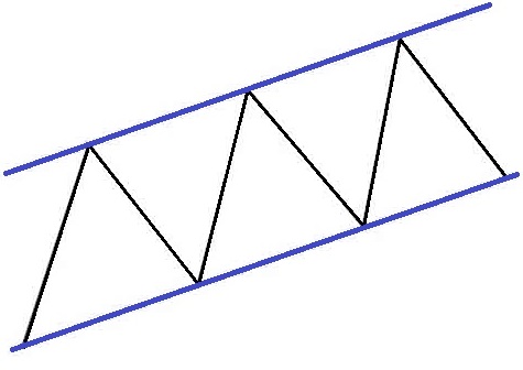
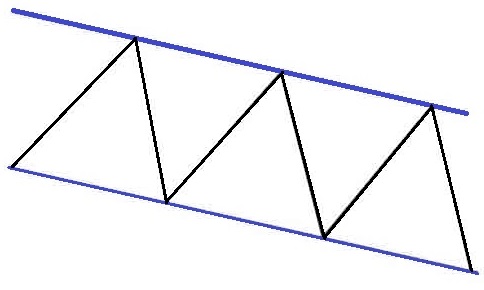
Trend channels: types, how to draw them, trading with the trend
A trading channel is a price zone between two parallel trend lines that price swings inside. The upper line acts as dynamic resistance, the lower one as dynamic support, and the slope splits channels into three types: ascending, descending and a horizontal sideways.
For me a channel is just sloped levels, the same support and resistance only running at an angle, which is why it fits so naturally into work with trend structure. You build it from real points: to draw an ascending channel you join at least two lows into a support line and run a parallel through the highs, for a descending one it is all mirrored, and a channel is considered reliable after three touches of its borders. There is an iron rule here that I always repeat: a channel is built from actual price points, not stretched to fit what you want, otherwise you are simply fooling yourself. You trade it two ways: inside the channel you buy at the lower border and book at the upper, and on a breakout you go with the exit, stop beyond the opposite border and target the width of the channel. But I do not enter off a border just because price touched it: I wait for a reaction and watch volume, because a border often becomes the spot for a false breakout where the big player collects stops. How trend structure unfolds further, through impulses, pullbacks and the change of priority, I cover below, in the section on market structure.
In short: A channel is a zone between two parallel lines, and the slope splits them into ascending, descending and horizontal; you build it from real points and do not stretch it to an idea, and an entry I take not off a touch but on the reaction and volume.
Market structure: impulse, pullback and the change of priority
Inside a trend the move is not solid, it breathes: a strong thrust in the trend's direction gives way to a pullback against it. An impulse is a wide move on raised volume, and the will of big capital shows in it. A pullback is a correction the other way, and in a healthy trend it runs on falling volume, because there are no truly strong participants against the main move. If a pullback suddenly accelerates on rising volume, that is the first hint that a counterforce has come into the market and the trend may be running out of breath.
On a live chart this reads literally off the volume under the bar, and an example from practice shows it better than any theory. Say there is a downtrend. A strong wave down runs on raised volume, I mark it to myself as a one, this is the impulse, and the seller's will is in it. Then price pulls back up, but already on noticeably lower volume, this is a two, a correction without force, because there are no serious buyers against the trend here. While the picture stays like that, the initiative is the seller's, and it is too early to think of buys, at best I look for a continuation down off the upper border of the pullback. But the moment the pullback goes on rising volume and takes out the previous high, the balance shifts: a counterforce appears, the structure creaks, and I stop considering sells until I understand who controls the market now. It is by this switch of volume from impulse to pullback that I decide whether to follow the trend further or wait for its break, rather than guessing reversals in advance.
These bricks build the structure. An uptrend is a chain of higher highs and higher lows, a downtrend the mirror, of lower ones. While the structure holds, I go with the trend and take pullbacks in its direction. And when it breaks, when price for the first time fails to update an extreme and takes the previous one in the other direction, that is a signal the character of the move is changing. A handy anchor here is the priority-change level, the price whose break and hold show that control of the market has passed from sellers to buyers or the other way round.
The cleanest read of the change is the break-plus-retest pairing. When price breaks an important level and then returns, tests it from the other side and pushes off, that says the auction has changed and a different side now leads the market. I do not catch the break itself, I wait for exactly that retest with a reaction, and the mechanics of real and false breakouts I cover in detail in the material on level breakouts.
When the structure breaks, the thing that matters is telling a real reversal from yet another trap, and here I watch three events in a row. First comes the false break: price jumps sharply past the edge of the range and dives straight back, sweeping the stops of everyone who believed in the continuation. Then the market breaks a key level the new way, and the triggered stop-losses drive that move on their own. Last comes the retest, when price returns to the broken level and checks it from the other side, and that is where I look for an entry in the direction of the fresh move. Each of the three steps I check against volume: on an honest reversal it rises, because big capital has stepped in, while an empty false break has no volume behind it, and without that confirmation I take none of the signs to work, otherwise you catch every second false break and bleed out on false signals.
This breathing has a simple skeleton worth naming. An uptrend is a staircase of ever higher peaks and ever higher troughs, the higher high and higher low, HH and HL. A downtrend is the mirror: a chain of lower highs and lower lows, LH and LL. While the staircase climbs evenly the trend is alive and I stay on its side. And when a rising series fails for the first time to make a new high and breaks the previous low, that is the change of priority: the frame has flipped and the initiative has passed to the other side. Smart Money call this same break a break of structure, but I read it not from markup but from the same highs and lows by eye, checking it against volume.
In short: A trend is made of impulses on volume and pullbacks without it; while highs and lows keep updating the structure holds and I go with the trend, while a break of structure shows the auction has changed. An honest reversal is given away by three signs in a row, the false break, the level break and the retest, and I confirm all three with rising volume.
Do chart patterns and indicators work? Why they're overrated
Since we are on chart reading, let me say a word about its most overrated part. Price patterns are recurring drawings traders try to guess continuation or reversal from: head and shoulders, double top and bottom among the reversals, the flag, the pennant and triangles among the continuation shapes. Knowing them well is worth it, but as a ready-made signal not one, in my experience, gives an edge, they play out roughly even. There is a famous illustration of this: build a chart out of coin flips and you will still see the same head and shoulders and triangles in it, which says plenty about how much a shape on its own is worth.
The reason is simple and important: everyone sees the patterns, and big capital uses that. The crowd is programmed, saw a flag, bought, saw a head and shoulders, sold, and a large player needs exactly that predictability to harvest liquidity and build a position against the crowd. So a pattern often gives a false break first, sweeps the stops and only then goes the real way. The one pattern I do use now and then is the flag, and not for the picture but for the target projection: after a sharp impulse and a sideways, the move usually continues by about the size of the first impulse, and that lets you size up reward to risk in advance. The rest I keep in my head as a map of crowd psychology. A separate trouble is indicators: RSI, MACD and moving averages, ADX, Bollinger Bands, the Ichimoku cloud or VWAP are calculated off past bars and therefore always lag, the signal arrives when the move has already happened. The indicator itself is not harmful, but I would not build an entry on it. The modern version of the same illusion is handing the decision to artificial intelligence: the model also learns from the past and cannot guarantee the future. The weak spots of chart patterns are covered separately in more detail.
Patterns have a third weakness too, a purely human one, subjectivity. Two traders on the very same chart will draw different lines and see different patterns, because the eye easily completes what it wants to see. There is only one cure for that, formalisation: entry, exit and stop conditions set in advance that do not depend on your mood. That is why I boiled my work with drawings down to one practical trick, the flag projection: I measure the height of the first sharp impulse and lay it off from the exit of the following sideways, getting a sensible target and a clear reward-to-risk ratio before the entry. That is not guessing from a picture but the plain geometry of the move, and therein lies the whole difference between a pattern as a signal and a pattern as a guide.
In short: Patterns are worth knowing by sight, but as a signal they come out roughly fifty-fifty, because everyone sees them and the big player harvests liquidity off them; indicators lag, so a level and volume are more reliable, and from the patterns I take only the flag, for the target projection.
Where to go next: from reading price to reading volume
Chart reading is the foundation, not the finish. Technical analysis looks at price, where it has been and what drawings it left, while volume shows the reason for the move: how much was traded at these zones and by whom. Price is the already accomplished, the imprint of the last deal, but volume voices the intent: where big money actually built or shed a position. By my own observations, clean trading off levels gave a result with a small edge, and once I added reading volume by the Wyckoff method, it grew noticeably. These are my personal figures over years at the terminal, not a promise, and everyone will arrive at their own. At the start I too fiddled with indicators for a long time: I shuffled the settings of moving averages and oscillators in search of the perfect combination, spawned extra trades, and the account still bled away on spread and commissions. At some point I simply cleared almost everything off the chart, leaving the volumes, and the quality of my decisions rose from that very cleanness, not from another clever setting. The logic is simple: a level shows where to look for a trade, and volume whether there is genuine interest from participants there. So if I were to lay out the order of learning again, I would go like this: levels first, then discipline and risk per trade, and only then volumes, whose route is gathered in the free course.
In short: Chart reading is the foundation, but a level only tells you where to look for a trade while volume confirms whether the interest is real; once I added volume analysis to clean levels, the quality of my decisions rose noticeably.
Frequently asked questions
It is reading the price and volume chart to work out where an asset is cheap and where it is expensive, and to find an entry. It answers not why price moves but where it is cheap and where it is dear, on the assumption that everything already known to the market is baked into the quote.
Usually the candlestick. It gives you the full price for the period and reads fastest thanks to the coloured body: one glance tells you whether price went up or down. A line chart is handy for the big picture and a bar chart takes practice, so the candle is the comfortable middle ground.
The higher ones, the hour and the day. They carry less noise and fewer false signals, leave more room for analysis, and the spread and commissions eat a smaller share. One more plus: a higher chart does not chain you to the screen, you can run it alongside a job.
Draw the level as a zone, not a perfect line along the very peak. Lean on several touches: the more often price responded to a patch, the firmer it is. And check it against volume, because a level that matters is one that large turnover passed through.
By volume. A real breakout runs on raised volume and settles beyond the level, while a false break is usually sluggish: price jumps past the level, collects stops and comes straight back. So it is wiser to wait for a hold and a retest than to dive into the false break at once.
As ready-made signals, in my experience, they work about half the time: everyone sees them, and big money harvests liquidity off them. The edge shows up when you play off zones and confirm the entry with volume, not when you guess from a drawing on the chart.
About the Author
Author: Igor Arapov — independent researcher in the psychology of investment decisions and behavioral finance, practising trader since 2013, founder of arapov.trade, author of a trading book series (ORCID: 0009-0003-0430-778X).