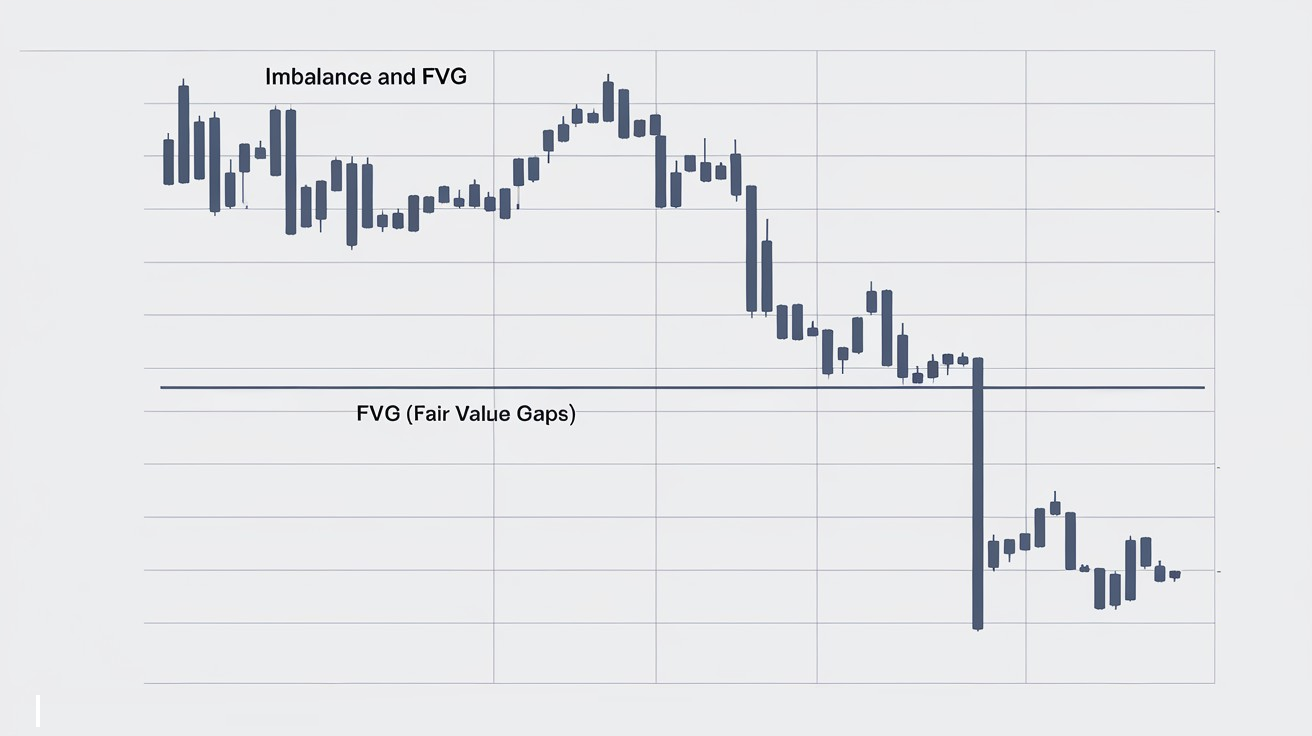
Chart patterns are the first thing most beginners reach for, but a naked pattern fills about as often as it fails, and leaning on the bare drawing is dangerous. The brain is wired to hunt for shapes even in chaos, and on a chart that turns into neat figures the market never agreed to respect. A pattern only starts to mean something on a strong level and with volume behind it, while the shape itself is mostly a magnet for the crowd, which is exactly what large capital feeds on.
So do they work? The bare shape gives no statistical edge over a long run of trades, and the success rates you see quoted online swing from fifty percent to ninety-something depending on who counted and how. What actually moves the odds is context: the level a pattern sits on, the false break that hunts stops, and the volume on the breakout and the retest. I don't trade patterns myself, and I've been trading a long time, off volume and the Wyckoff method. If you're only just getting to grips with the chart, the place to start is the basics of reading a price chart.
In this article we'll cover:
- patterns split into reversal and continuation, and you read either one only together with volume;
- head and shoulders, double tops and bottoms confirm only on a neckline break with volume;
- triangle, flag, pennant and the cup show a pause in the trend, not a turn;
- a naked shape fills roughly fifty-fifty, so the level, the false break and the volume decide.
Let's start with what a chart pattern even is and why the brain is so fond of drawing them.
What is a chart pattern, and why the brain hunts them in noise
A chart pattern is a recurring shape on a price chart that traders use to anticipate the next move. The family includes head and shoulders, the double top, triangles, flags and the rest of the classical technical-analysis kit.
Where these shapes come from is a question for psychology. We were taught back in school that the brain evolved to pull objects out of the surroundings, the tiger in the thicket being the textbook case: miss the predator and you're lunch. The market is that thicket for us, an endless churn of price, and all technical analysis can really do is impose a legible structure on the churn. That is where patterns come from, a way to order apparent chaos so you can place trades against it. There's a rational grain in them, because a double top really does show that buyers failed twice to push higher. The catch is simple: the market owes our drawings nothing. So I treat patterns with caution and consider the most sensible tool in the whole technical-analysis kit to be levels rather than contours, because a level is the trace of real interest and not a geometry we laid on top.
In short: A chart pattern is a shape the brain finds in the noise of price, but the market need not respect it, so it's safer to lean on levels than on the form.
Reversal vs continuation patterns: what's the difference
It's useful to split every pattern into two camps, and the difference between them matters. Reversal patterns hint that a trend is running out of breath and may flip: the classics here are head and shoulders and the double top and bottom, and they appear at the end of a move, once the force that drove price starts to fade. Continuation patterns say the opposite: after a short pause the trend will most likely resume in the same direction. Those are flags, pennants, triangles and the cup with handle, the market catching its breath before another push.
One condition makes or breaks any of them. I read a pattern only in tandem with volume. A real breakout runs on rising activity, while a sluggish exit with no volume behind it is usually a trap. Volume is the reaction to price, and it's what separates a working formation from a merely drawn one; why it decides so much I cover in detail in the section on volume analysis. The second filter is the timeframe: the higher it is, the more seriously the pattern deserves to be taken. A formation on the daily or weekly weighs incomparably more than the same contour on a five-minute chart, where it's usually just noise that happens to look like a figure. I keep both filters, volume and the higher timeframe, in mind on every single formation that follows. A flag is a narrow sloped pullback after an aggressive run, the market taking a breath before the move tends to extend. A triangle is a gradual squeeze where the swing range melts as both sides build up pressure. Even there I don't trade the contour itself, but wait to see which way price breaks the figure and whether volume arrives on the exit.
In short: Reversal patterns catch the end of a trend, continuation patterns catch its pause, but read either one only with volume and on a higher timeframe, or it's just a picture.
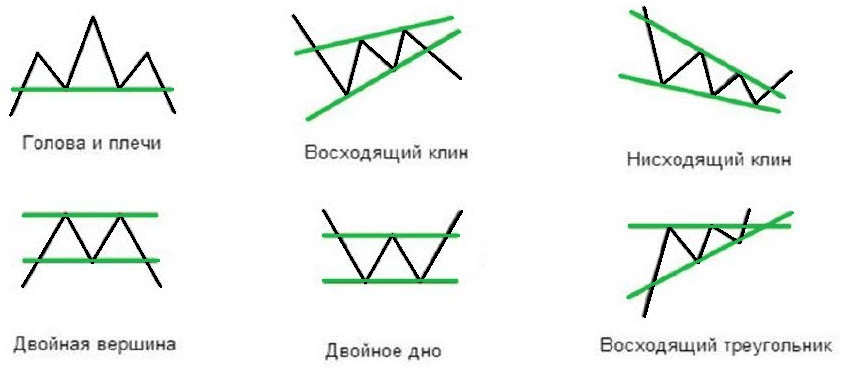
Head and shoulders: the reversal pattern and its biggest trap
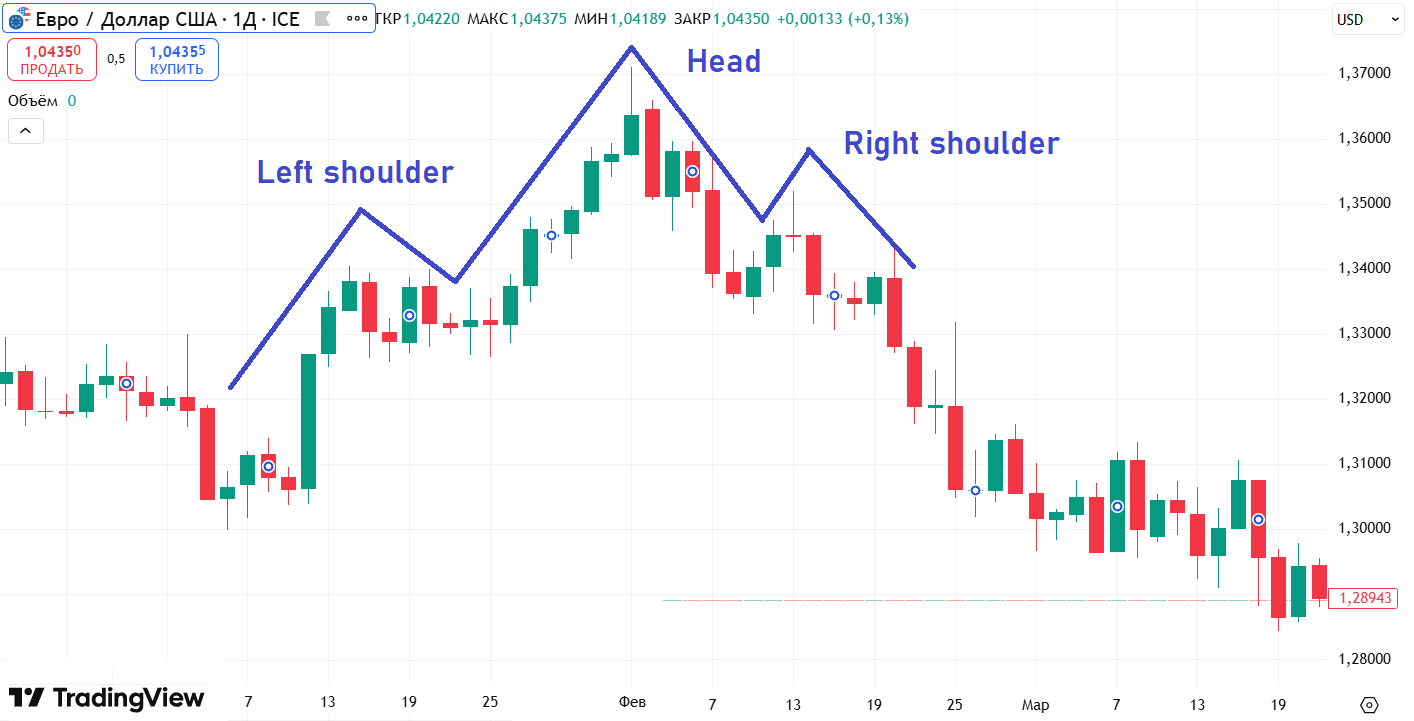
The head and shoulders is a reversal pattern of three peaks at the top of an uptrend: a left shoulder, a higher head in the centre, a right shoulder roughly level with the left, and beneath them a neckline whose break is read as the signal of a turn lower.
The mechanics are plain. Price first makes a high and pulls back, that's the left shoulder. It then prints a higher high, the head. The third push falls short of the head and forms the right shoulder: it's as if the buyers' battery is draining, each attempt weaker than the last. The neckline is the support drawn across the two troughs between the peaks, and while it holds, the figure is only ripening. The turn counts only once the neckline breaks downward; before that you have a sketch that can fall apart. In numbers: if the head sits at 1.2740 and the neckline runs at 1.2585, the figure is 155 pips tall, and the rough target after the break is around 1.2430, the neckline minus the height. There's a mirror version, the inverse head and shoulders at the bottom of a fall, which turns the market upward by the same rules in reverse. Volume should fade from the left shoulder to the head to the right shoulder, the sellers running out of breath, and demand should step in on the break. Context is what lets you spot it at all: the figure means something only after a clear trend, otherwise you're looking at random bumps, and perfect symmetry is rare, which is fine. Now the part that matters more to me than the silhouette. Time and again, before the real move, price is yanked through the neckline in a false break, stops are swept, and only then does it head where it was always going. That's a shake-out for liquidity, taken precisely at predictable levels like this one, and I describe the mechanism itself in the section on working with levels and liquidity gaps. So I don't pile into the first neckline break; I wait for a hold and a nod from volume. The picture itself reverses nothing; what reverses the market is the people who believed the picture and lined up to sell beneath the neckline, partly a self-fulfilling prophecy that large capital is happy to use.
In short: Three peaks with the head in the centre and a neckline below, but the turn counts only on a neckline break with volume, and the first spike through is often a stop-hunt rather than a signal.
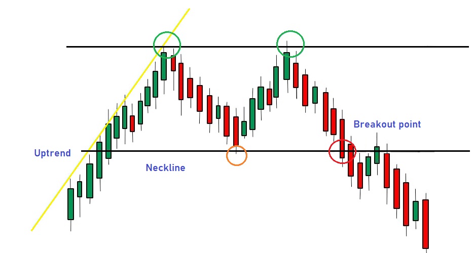
Double top and double bottom: telling a reversal from a range
A double top is a reversal pattern at the top of an uptrend: price makes a high, pulls back, runs up again into roughly the same level, and can't break it a second time. The horizontal across the interim low between the peaks is the neckline, and the exit from the figure is measured from it.
What the figure shows in essence is that buyers failed twice to deliver higher, demand has run dry, and from here a turn lower starts to ripen. The double bottom works as a mirror at the floor of a fall, where sellers fail twice to press lower, and a neckline break upward turns price into a rise. There's a rational core here, but one picture isn't enough. The standard beginner trap is that any up-and-down chop looks like a double top, while in reality it's more often a range, a flat with no direction. To avoid inventing the figure where it isn't, I check context: a genuine reversal needs a pronounced prior trend, since you can only reverse something that was clearly going somewhere. The peaks should stand at roughly one level with a noticeable pullback between them rather than minor chop, and while the neckline holds, this is still a range and not a signal. Volume is what decides it for me. On an honest double top, activity at the second peak is usually lower than at the first, a visible weakness in the buyers: the crowd is still dragging price up, but there are no large purchases behind it any more. On the neckline break down, by contrast, volume rises and real selling appears. Without that confirmation I don't trust the figure, because price often spikes through the level, knocks out stops, and large capital quietly builds a position against the crowd in that very moment. I take the entry not on the second touch, where the crowd buys, but after the neckline breaks and price holds beyond it, on the retest of the broken level, with a stop past the local extreme and a small risk. The target I measure from the height of the figure, projected from the break, and that's a reference, not a promise.
In short: Two highs at one ceiling with a neckline break down, but while the neckline holds it's a range and not a figure, and volume decides: lower on the second peak, higher on the break.
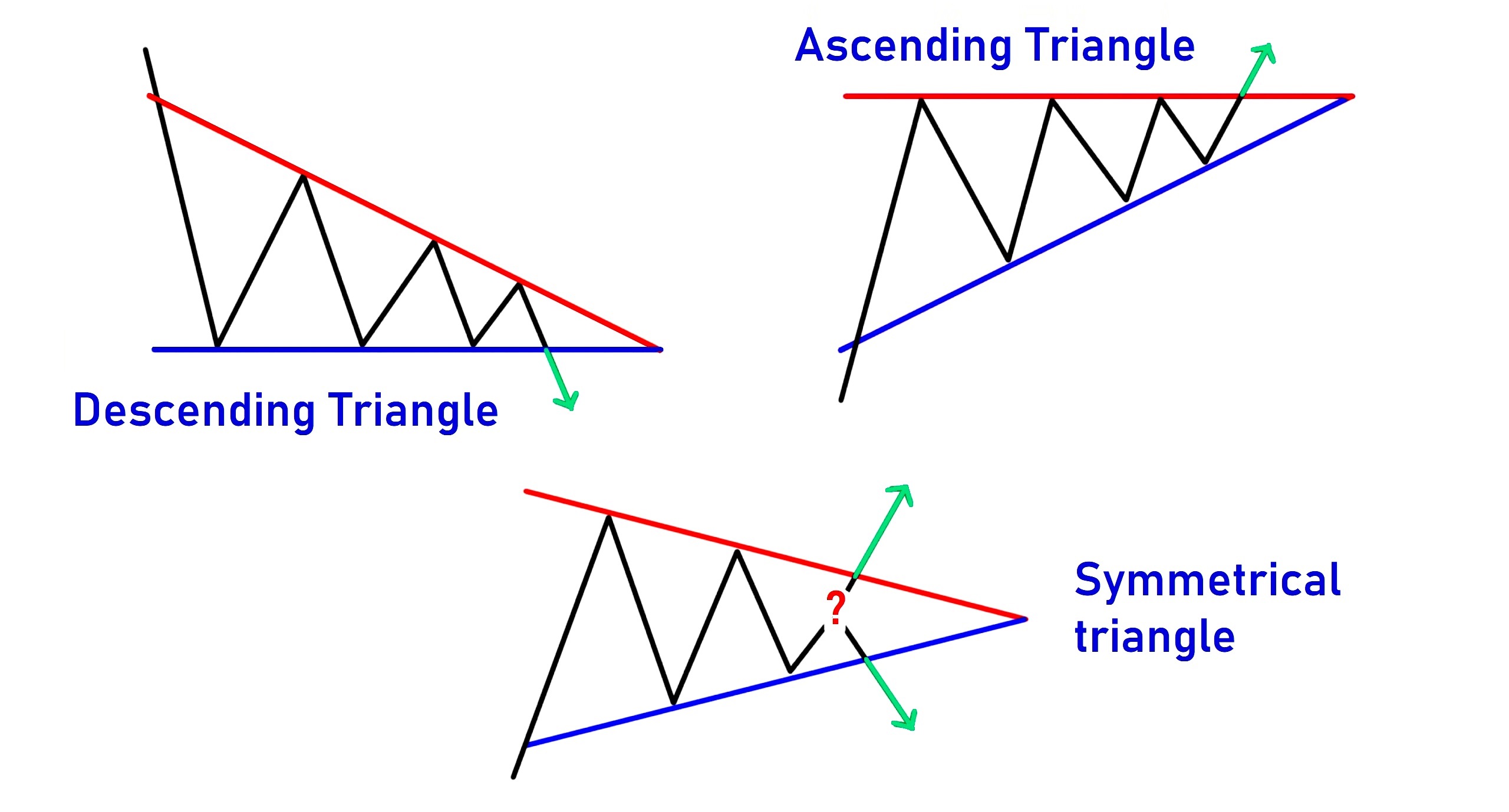
Triangle patterns: ascending, descending and symmetrical
A triangle is a consolidation pattern drawn by two converging lines, one across the highs and one across the lows. Inside it price ranges ever tighter, the amplitude fades, volume usually drops, and this is the quiet phase where the market builds pressure before exiting with an impulse beyond one of the boundaries.
Three kinds get singled out. In the ascending triangle the lower line rises while the upper stays flat; the higher lows betray buying strength, and an upside exit is more often expected. In the descending one the upper line falls against a flat lower line; the lower highs read as weakness, and a downside exit is more often expected. The word "more often" is the key there, since there's no guarantee. The symmetrical triangle is the more honest of them: both lines converge toward each other, buyers and sellers are roughly matched, and it openly says the direction is unknown. There's a view that the symmetrical one tends to continue the prior trend, and there's truth in it. I often see in my own market reviews how price coils into a triangle like a spring and then leaves in the direction it came from, the longer the squeeze the stronger the exit. But I won't bet on that blind, because it breaks against the trend just as readily. I enter not on the contour but on the horizontal boundary as an ordinary level: I wait for a break with a hold, then enter on the retest, with a stop past the opposite side and a target by the triangle's height at its widest. The ascending and descending read a touch clearer than the symmetrical precisely because of that horizontal edge. A close relative of the triangle is the wedge, where both boundaries slope the same way, but I treat it the same: the geometry is only a reason to look, while the decision comes from volume on the exit and price's reaction to the level. And the main reason to know triangles at all is that the crowd trades them identically and parks stops in predictable spots, which large capital often spikes through on purpose to gather orders before turning the other way.
Next to the triangle sits its slanted relative, the wedge. The lines converge here too, but both tilt the same way: a rising wedge drags both support and resistance upward, and for all its outward cheer it more often turns price down, because the climb runs on a fading range. A falling wedge is the mirror: both lines point down, yet it often resolves upward. As with any figure, the wedge by itself is only a reason to look closer for me: I wait to see which way it resolves on rising volume, and only then count the exit as real rather than one more squeeze before a false break.
In short: Price squeezing between converging lines with fading volume; ascending hints up, descending down, the symmetrical gives no clear direction in advance, and I take the entry on a boundary break with volume, not on the figure.
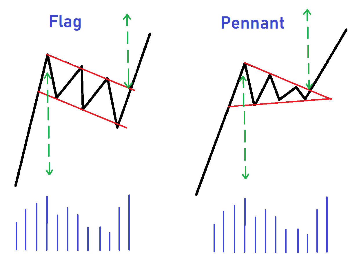
Flag and pennant: the continuation patterns I respect
A flag is a continuation pattern where, after a sharp impulse, price drifts into a small sloped channel against the move and then breaks it to carry on in the trend direction. I'm cool on patterns in general, but the flag is the exception, because it rests on mechanics rather than faith in a drawing.
Here's the simple version. First comes the impulse, the pole as I call it: price covers ground sharply and aggressively, volume on that run is high, and there's little supply against it. Then a lull, price sliding into a narrow channel sloped against the impulse, with volume dropping inside it. That's the flag. The logic is honest: a sharp pole is the trace of one side being clearly stronger, and a sluggish pullback is a pause, not a reversal. The wave-length ratio is the first thing I check, since the trend leg should be noticeably longer and sharper than the pullback, or the trend is already exhausted and I don't trust the flag. A close relative is the pennant, the same pause after an impulse, but its consolidation converges into a small symmetrical triangle instead of a parallel channel; what tells a pennant from a plain triangle is the mandatory pole before it. The classic entry is a break of the boundary in the trend direction, but I don't lunge at the first spike, I wait for a hold and a burst of volume. Here's the key nuance the flag earns its respect on: price often makes a false break the other way first, sweeps stops, drags traders the wrong direction, and only then leaves with the trend, and the mechanics of that exit I unpack in the piece on trading level breakouts. The flag's recognisability is both its strength and its weakness: because the whole crowd sees it and enters on the break, that's exactly where it's convenient to feed liquidity. The stop sits logically past the opposite boundary of the channel, so the loss is known in advance if the figure fails. Both patterns are universal and show up everywhere, on stocks, forex, crypto and futures, especially often on crypto thanks to high volatility where the impulse pole stands out clearly. But I'd look for them on higher timeframes, from four-hour and up, since on the minutes it's more often noise that merely resembles a flag.
In short: A flag is a sharp pole on volume plus a sluggish pullback against the trend, a pennant is the same pause as a converging triangle, and the entry is on a break with volume after the false break, not on the first spike.
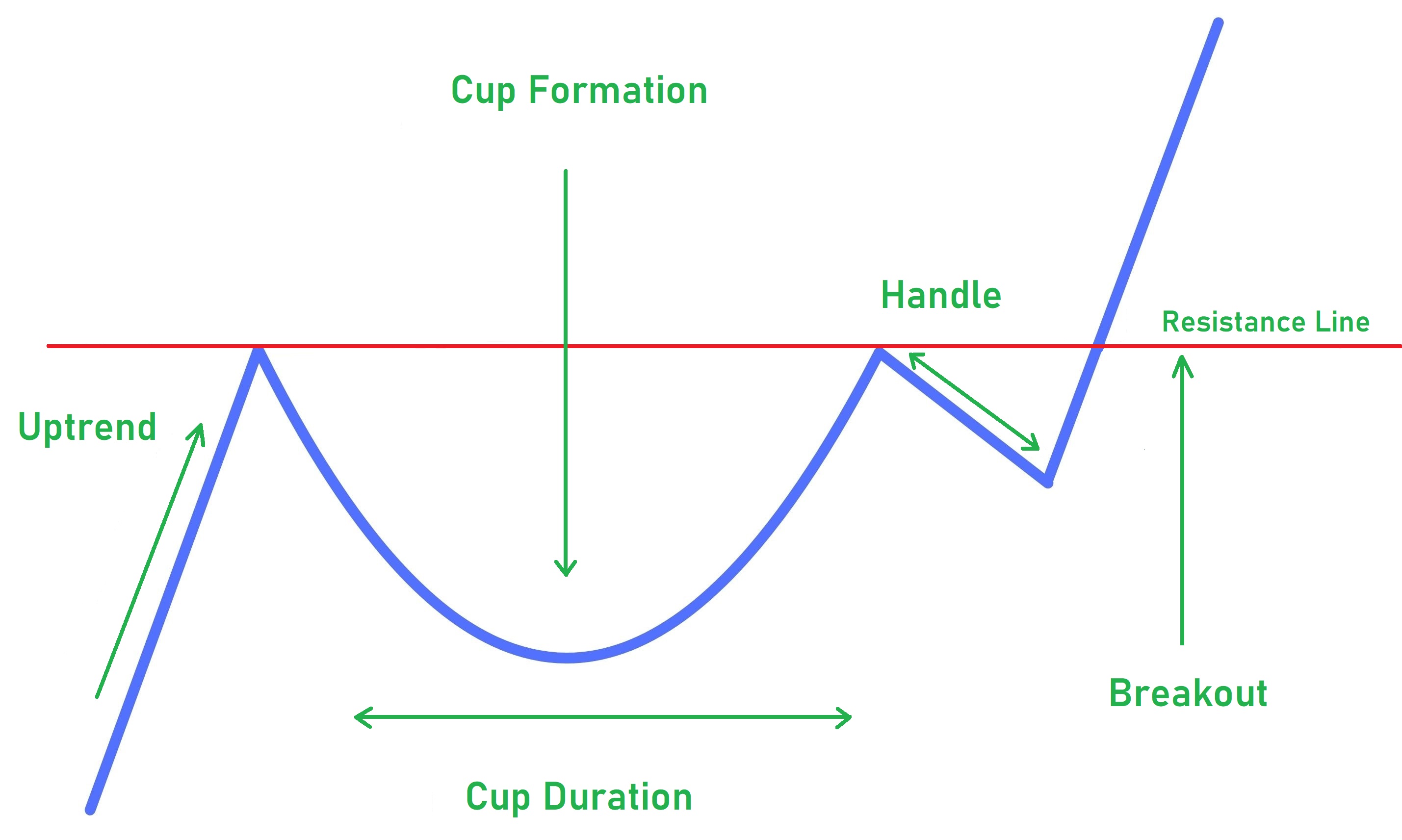
Cup and handle: where its liquidity is hiding
A cup and handle is a bullish continuation pattern in which, after a rise, price makes a smooth rounded correction, the cup, returns to the prior high and forms a short pullback, the handle, and then breaks the level upward.
William O'Neil described it in 1988 in his book on profiting from stocks: studying growth leaders, he noticed they often drew this silhouette before a new run, the side profile resembling a teacup with a handle. The cup is a rounded base, and O'Neil valued the smooth shape over a sharp V, with the depth by his measure usually twelve to thirty-three percent of the prior rise, more in volatile periods. The handle is a short consolidation on the right near the old high, and it shouldn't dig too deep. The contour itself barely interests me, since a bare cup, like every other figure, fills about fifty-fifty. The first thing I check is context: the cup is a continuation, so it has to grow out of a live uptrend, and in a fall or a sluggish range the shape means almost nothing. But here's what the figure is worth knowing for. The handle is in essence a shake-out: before leaving upward, price often dips under the level, trips buyers' stops and lures breakout traders into shorts, a false break for collecting orders. After it, price bounces and goes with the trend. The classic entry is a break above the handle's high, but I don't enter on the spike itself, rather after a hold above with volume confirmation, with a stop under the handle's low, or under the cup's base in a weak trend, and a one-to-two-percent risk. I'm not saying the cup doesn't work, O'Neil has decades of observation behind it. I'm saying the shape alone, without volume and context, gives no edge: if the handle swept stops and volume arrived on the exit, I trust the continuation; without volume, no correct shape will convince me. The figure was conceived on stocks and turns up there most, on growth leaders' dailies and weeklies; crypto loves it too with similar logic and deeper cups, while on futures and forex it's rarer. The cup needs time, weeks and months on the daily and weekly, so I look for it from four-hour and up, otherwise it's just noise that resembles a cup.
In short: A rounded correction plus a short handle with an upside break, but the value sits in the handle where a false break sweeps stops, not in the contour; enter after a hold with volume, stop under the handle's low.
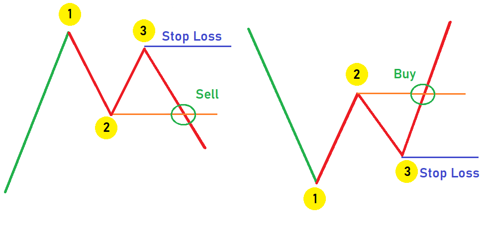
The 1-2-3 pattern: entering behind smart money
The 1-2-3 pattern is a reversal of three points: point 1 marks the last extreme of the old move, point 2 is the first pullback from it, and point 3 is a second pullback that no longer breaches point 1. I skip most textbook formations, but the 1-2-3 stands apart, because you can read the logic of large players in it.
Take a bullish reversal, where a falling market gathers to turn up. Point 1 is the last low of the fall; price bounces off it and prints a local high, point 2, then corrects but no longer drops below point 1 and sets a higher low, point 3. For a bearish turn it's all mirrored. The reversal counts as confirmed once price breaks the level of point 2, and before that the figure can still collapse. Three points on an empty chart mean little, so I look for them only on strong levels: point 1 should land on an impulse level that powerful moves have left from before, and the higher the timeframe, the cleaner the result. And the same filtering of false signals applies: price is often dragged just under point 1 first, stops are swept, and only then is it reversed, a false break for liquidity. If that spike ran without volume and reversed quickly, for me that's a profit to the figure rather than a reason to run. What you trade it for is the entry. Conservatively you can wait for the break of point 2, but price has already moved by then and the stop ends up further away. The entry at point 3 itself gives the shortest stop and the best risk-to-reward, because you're stepping in ahead of the crowd, and in my experience even being right a little more than half the time, a ratio from one-to-two pulls the account into profit over a run. I confirm point 3 with two things: volume, meaning selling fading on the pullback with demand at the level, and a pin bar, a candle with a long lower wick, which I cover in more depth in the piece on candlestick patterns. Behind the three points sits readable capital at work: near point 1, where it's cheap, smart participants build a position; at point 2 they partly bank profit into the crowd's demand; at point 3 they add again at a good price, which is why it doesn't breach point 1. We're not guessing, we're following the ones who move the market, and volume is what highlights them. The stop I hide beyond point 3, the target I measure by the ratio or to the nearest level, and the risk size is everyone's own call, mine being one to two percent per trade.
In short: Three points on a strong level, the reversal on a break of point 2, but the entry at point 3 gives a short stop and a better ratio; behind the points sits large-capital accumulation, and volume is what tells the figure from geometry.
Do chart patterns work, and what I watch instead
Let's pull it together. Any figure, reversal or continuation, fills in my experience about as often as it doesn't. The naked drawing gives no statistical edge over a run of trades, and the success rates that travel around the internet swing from fifty percent to ninety-something because so much comes down to who counted and how. There simply is no single confirmed number, and a pattern is not a profit button. It's worth pausing on those famous figures, the head and shoulders with its quoted eighty-nine percent and the rest: read the fine print and the high score always belongs to a confirmed pattern, a neckline break on volume, not to the bare shape. In other words it's the level and the volume earning the percentage, exactly the two things I watch.
So why know patterns at all. The picture doesn't reverse the market; the participants who saw it and acted do: everyone waits for the neck or boundary to break and stacks orders at one point, and the move partly happens because of that, a self-fulfilling prophecy. Patterns literally program the crowd: see a flag, buy the break. And large capital uses exactly this, since a recognisable formation is a convenient place to harvest liquidity, a spike through the boundary sweeps the stacked stops, and price often leaves the other way after. So I hold a pattern not as a signal but as a map of market psychology: it tells me where the crowd is predictable and where its stops sit. What I watch is not the beauty of the contour but three things: which level holds the liquidity, whether there was a false break, and what volume shows on the breakout and the retest. That's more dependable than any silhouette, because it reads the actions of those who actually move price rather than geometry we laid on top. And always with a stop and a small risk per trade, since even the best context is a probability, not a guarantee. My full take on patterns I lay out in the video on why technical-analysis patterns work about fifty-fifty.
In short: The naked contour fills roughly evenly and gives no edge; patterns program the crowd and large capital harvests liquidity on them, so I watch the level, the false break and the volume, not the shape, and always with a stop.
Frequently asked questions
On its own a pattern fills about as often as it fails, and the naked shape gives no statistical edge over a long run of trades. It starts to mean something only on a strong level and with volume behind the move. The success rates quoted online swing from fifty percent to ninety-something because so much depends on who counted and how, so a pattern is not a profit button.
There is nothing reliable in the sense of a guarantee, and every naked shape is roughly a coin flip. Of all of them I lean toward the flag, because it rests on clear mechanics: a sharp impulse shows one side is stronger, and a sluggish pullback is a pause rather than a reversal. The 1-2-3 also stands apart, since you can read large-capital accumulation in it, and entering at point three gives the best risk-to-reward.
Because the picture itself reverses nothing. The market is moved by participants who saw the picture and acted on it. The whole crowd spots a familiar shape and stacks orders in predictable places, and that is exactly where large capital harvests liquidity: it spikes through the boundary, sweeps stops, and often leaves in the opposite direction. So I watch the level, the false break and the volume, not the shape.
Reversal patterns hint that a trend is running out of breath and may flip, and they show up at the end of a move: head and shoulders, double top and double bottom. Continuation patterns say the trend will resume after a pause, and those are the flag, pennant, triangle and cup with handle. Either type is worth reading only together with volume and on a higher timeframe.
Volume, levels and the Wyckoff approach. I read what large capital is doing rather than try to guess a drawing: which level holds the liquidity, whether there was a false break, and what volume shows on the breakout and retest. Knowing the pattern is still useful, but as a map of crowd psychology rather than a signal for blind trading, and always with a stop and a small risk per trade.
About the Author
Author: Igor Arapov — independent researcher in the psychology of investment decisions and behavioral finance, practising trader since 2013, founder of arapov.trade, author of a trading book series (ORCID: 0009-0003-0430-778X).